Overview

Matt's blog for exclusive behind-the-scenes photos and videos, news, interviews, updates with film subjects, sources of inspiration, and more.

Facebook
Vimeo
Instagram

Search
Wednesday
Jul302014

Got A Girl

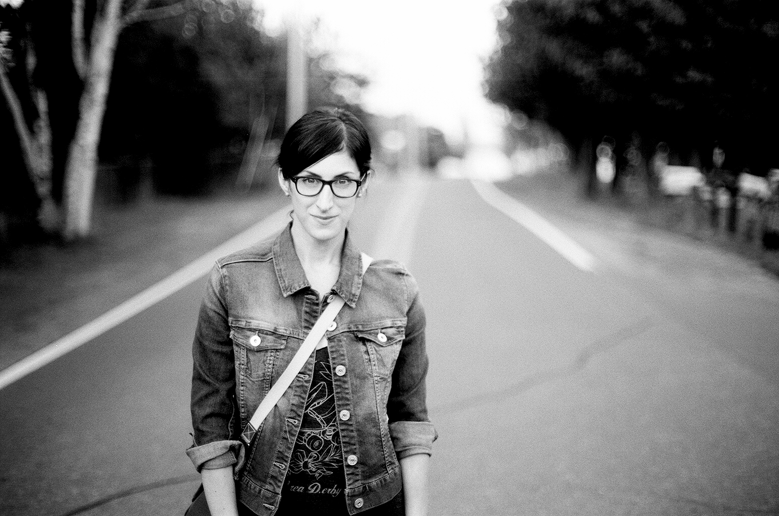
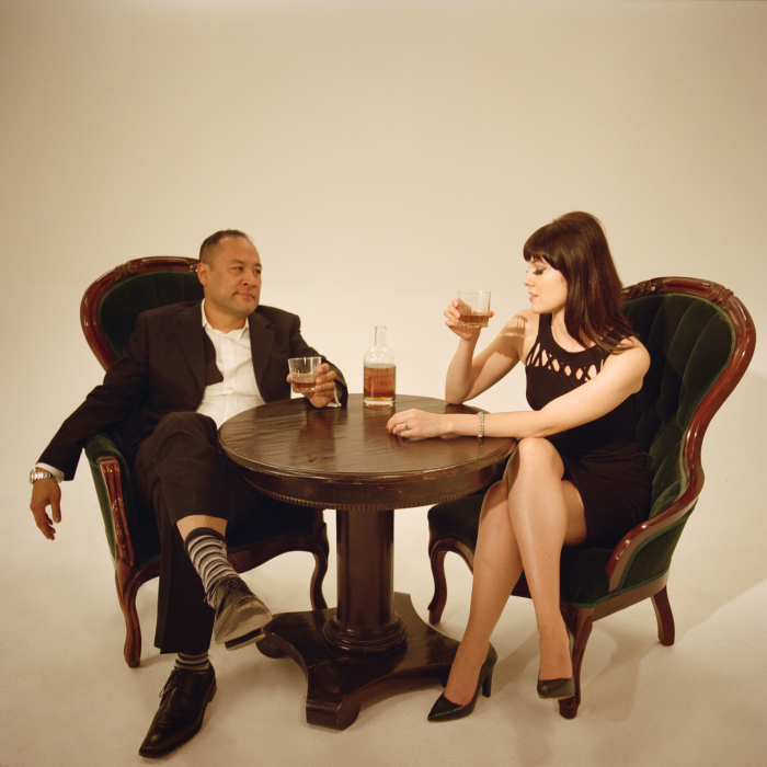
I met the multitalented Mary Elizabeth Winstead through her writer/director husband, Riley Stearns. Mary recently collaborated with producer Dan The Automator on a music project called Got A Girl. It's a fantastic album- alternatively fun and moody, and soaked in vintage French pop and orchestrative hip hop. Sort of he musical equivalent of wearing a velvet smoking jacket and drinking Champagne.  

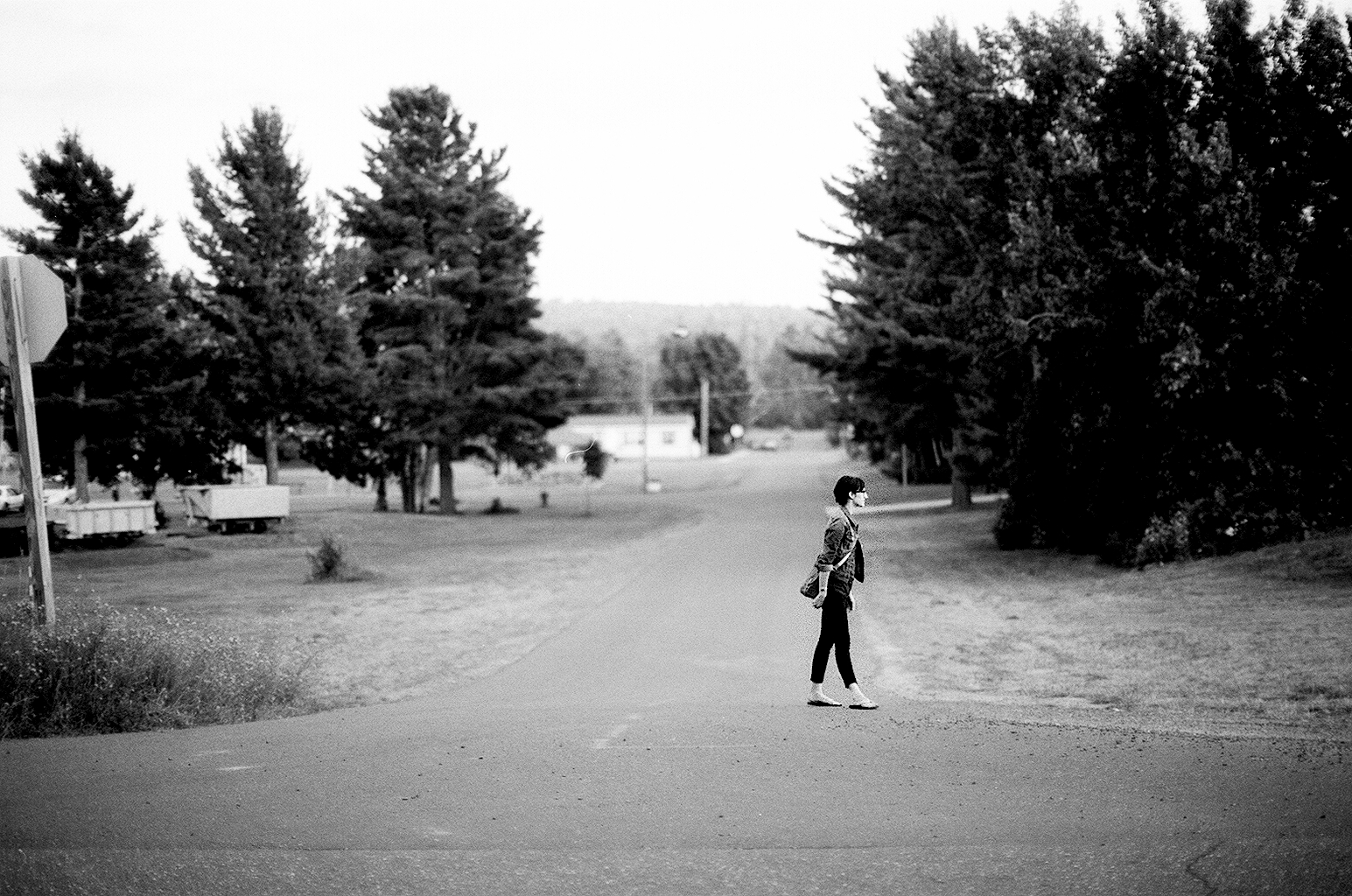
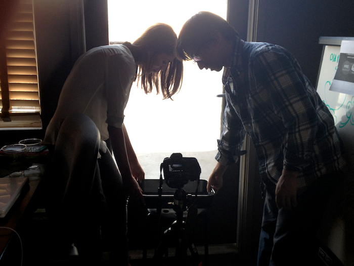
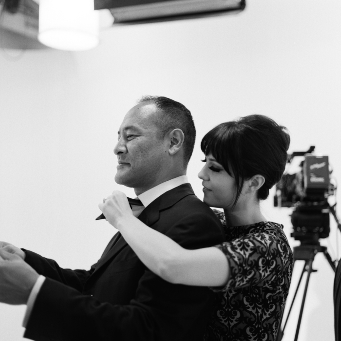
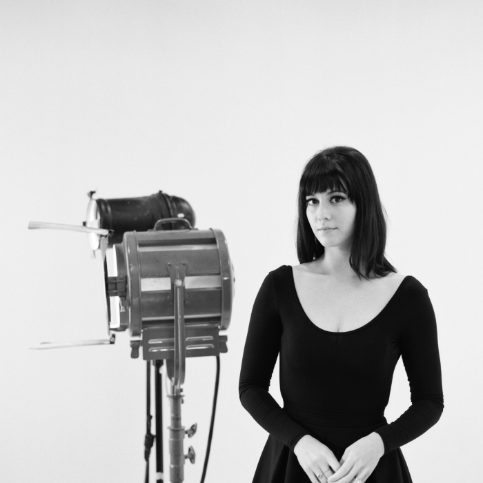
Mary asked me to direct a series of teasers for the album and I jumped at the opportunity. I've been making documentaries for so long that I've been dying for a chance to try something new. The idea was that the teasers would mostly be inspired by quirky vintage advertisements, with a bit of French New Wave thrown in for good measure. We collaborated with Maker Studios and were able to knock out 10 spots in one day. The idea was to keep everyting simple and abstract, that way we could play with ideas and make things up on the day if we wanted. 

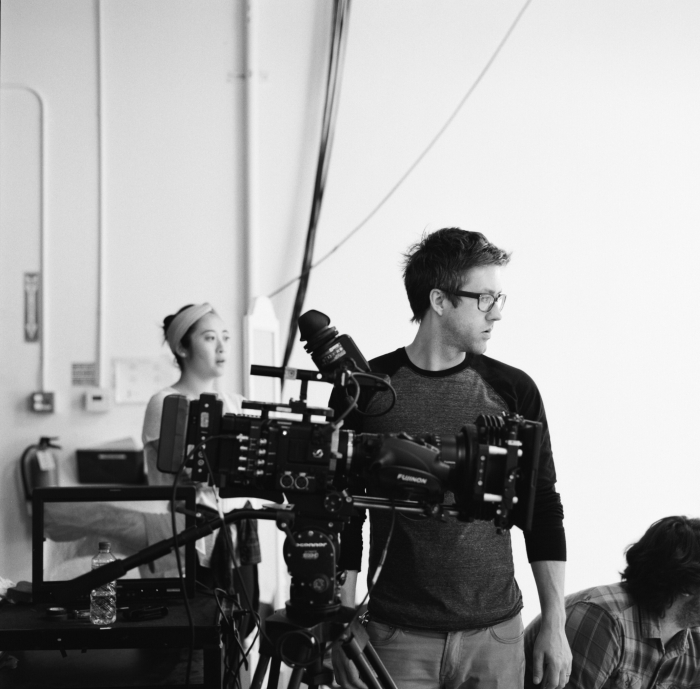
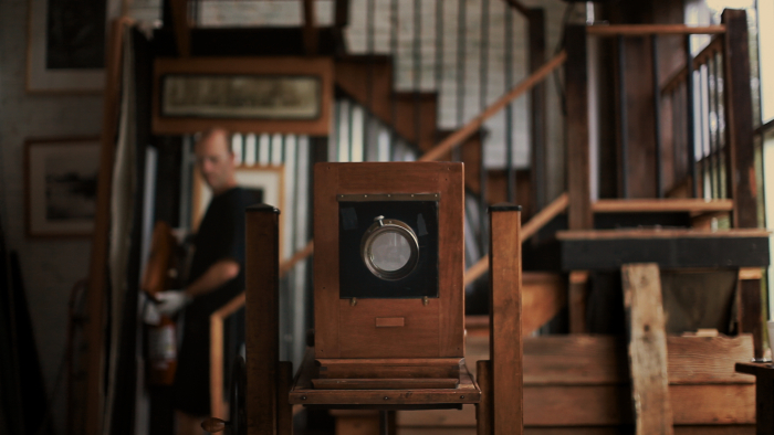
We shot on an Sony F55 with a Fuji Cabrio 19-90 lens- my first time with this camera and a really great experience. DP Jon Na and the rest of the crew were great at switching set ups and keeping things as simple as possible in order for us to maximize the limited time we had available. I couldn't believe we were able to do everything we wanted in one day. 

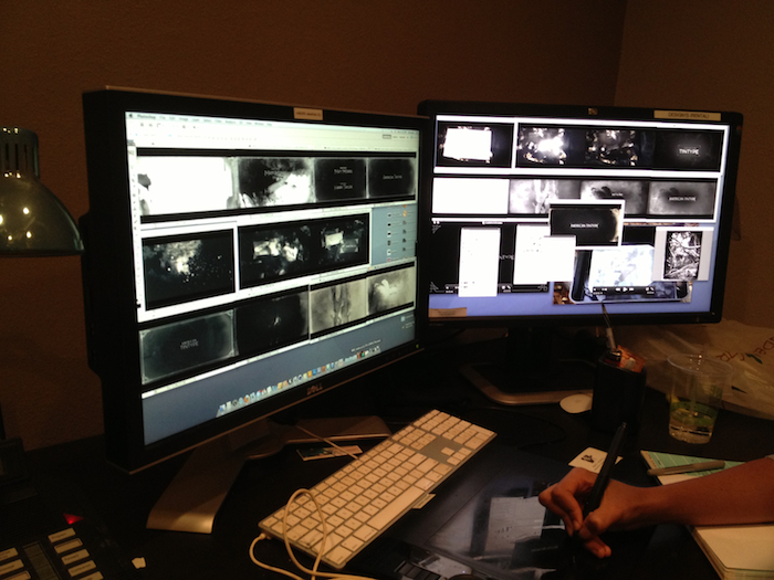
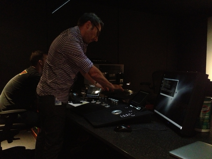
The post-production was a rush as well- they started rolling out online a week after our shoot. I stayed up editing the night of the shoot and had two spots cut together by morning, which were then color-corrected that afternoon. My friend Diego Ongaro provided the heavily accented narration from his cabin in the woods of the Berkshires via the power of the internet, despite being in post-production of his own film, Bob and The Trees.

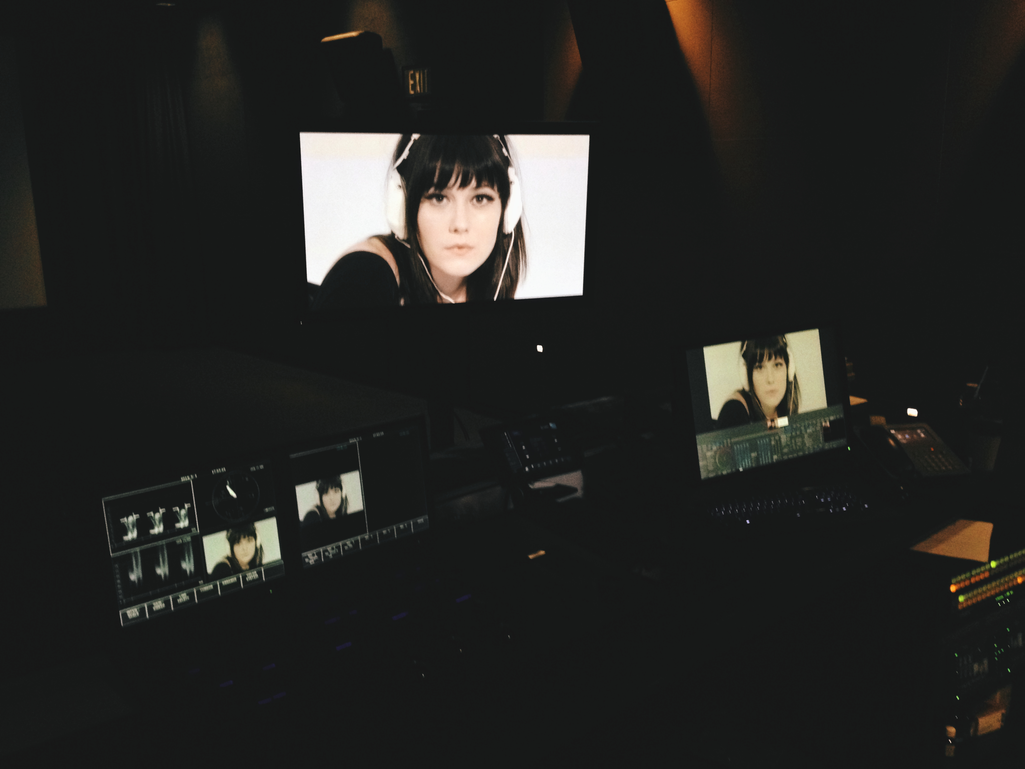
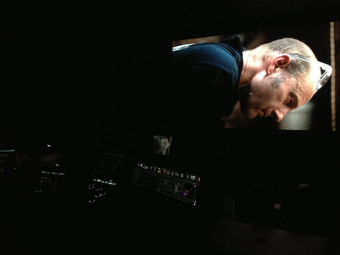
I was extremely lucky to work on the color with Natasha Leonnet at Modern Videofilm, who squeezed me in between projects. It was a joy sitting down and establishing the two "looks" for the spots (including glorious film grain), which she would later apply to the others as I finished editing. Sound was edited and mixed by Brandon Proctor at Skywalker Sound. 

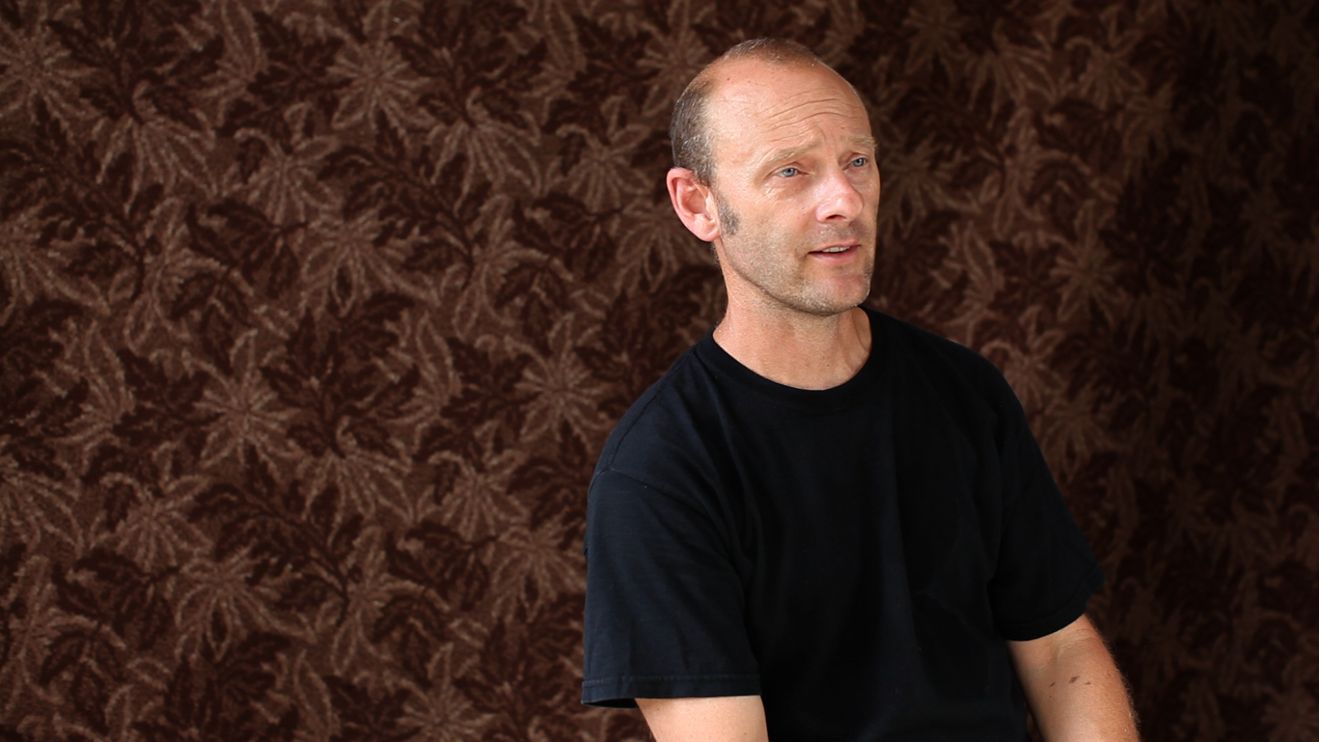
Working with a talented actor certainly has its upsides. When I make documentaries, I can't explicitly tell people what to say or do- I have ideas of how I want things to go, and I try to create situations where they will happen without me forcing it. It's an interesting process, but can certainly be frustrating if things aren't going the way you'd like. And of course, the subjects are people who are not familiar with the mechanics of filmmaking, and aren't sure how things will look or cut together, which often works against you. This was a very different experience.

The first spot we shot was a single take of Mary listening to the album. Mary had the idea of using a specific song and we wanted to use a slow zoom and have her eventually look directly down the barrel of the lens. There were a few moving parts here- mostly in terms of timing, and I had ideas about how I wanted Mary's movements to progress, but I figured we'd shoot one just to see how it looked so I could better describe what I wanted and how we should change things for the next take. Instead, Mary nailed it on the first try and every one after that. Her control over her movements and understanding of the progression of feeling was spot on. The mood of the piece was perfect, and it's still one of my favorites.

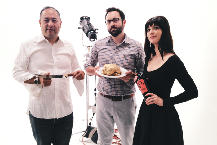
The rest of the spots were a lot of fun to conceptualize and shoot- especially when you have an excuse to paint a chicken gold or saber a bottle of Champagne in slow motion. Both Dan and Mary brought a lot of great ideas to the table. 

The album is out now and I highly recommend checking it out. Mary can next be seen in Riley's feature film FAULTS, which premiered at SXSW this year. The glimpses of the film that I've seen are enormously exciting- Riley is one of the rare talents with a unique voice who knows exactly who he is as a filmmaker right from the start. Both Mary and Riley are wonderful, inspiring, and talented people, and make me want to move into more narrative filmmaking as soon as possible.

M

Wednesday
Sep112013

Black and White

A few recent shots on Ilford black and white film- my personal favorite.

Emma in Eagle Harbor, MI. Nikkormat FTN 55mm f1.2 Ilford Delta 100

Emma in Eagle Harbor, MI. Nikkormat FTN 55mm f1.2 Ilford Delta 100Bodega Bay, CA. Nikkormat FTN 55mm f1.2 Ilford Delta 100J.C. Penny, Petoskey, MI. Nikkormat FTN 55mm f1.2 Ilford Delta 100 Eagle Harbor, MI. Nikkormat FTN 55mm f1.2 Ilford Delta 100MJ, Chateau Boswell, Calistoga, CA. Nikkormat FTN 55mm f1.2 Ilford Delta 3200MJ, Chateau Boswell, Calistoga, CA. Nikkormat FTN 55mm f1.2 Ilford Delta 3200Lail Vineyard, Yountville, CA. Zeiss Ikon Nettar 515-2 f6.3 Ilford Delta 400

Tuesday
Aug272013

The Joys of Instant Photography

A few months ago, I was in Los Angeles and grabbed coffee with my friend Eric Steelberg. Eric's a talented cinematographer and mentioned a piece of gear he wanted me to check out. Expecting the latest digital gadget to appear out of his bag, I was surprised to see him pull out a large brick of a camera that I'd never seen before. It was a Polaroid 180 Land Camera from the 1970's.

This was not the type of Polaroid I was familiar with. Eric had one of those as well, a SX-70 loaded with Impossible Project film. But it was the 180 I was drawn to. He arbitrarily took a photo, pulled the sheet of film out of the camera, and 90 seconds later peeled away a photograph of incredible quality. Unlike most Polaroid cameras, the 180 has full manual control, the image is rectangular instead of square, and has a nice white border. Fuji still makes two film stocks for these types of cameras- a 100iso color and 3200iso black and white. Even better, you can buy them on Amazon with free shipping.

I couldn't help but but think of Harry Taylor, this subject of my short documentary American Tintype, and his work. There's something amazing about having a physical photographic print in your hands moments after the photo is taken through a purely mechanical and chemical process. No electronics involved. With Eric's encouragement, I set off to find one for myself and within a month, found a lovely 180 on Ebay.


It's been a joy- The photos look amazing, and everyone gets a kick out of seeing the camera and how the prints develop. My heart always beats faster during the 20-90 second wait during development- as I peel away the photo, I wonder, did I capture the moment I wanted? Did my tricky double exposure work? When everything goes well, the feeling can't be beat.

At the same time that I've embraced analog instant photography, I've also spent more time using Instagram (@mattmorrisfilms). I should note that previously, I'd dismissed both Polaroids and Instagrams as gimmicks. I've had people ask me, "Why take a polaroid when you can get a much better image on medium format? Why use the iPhone when a 5D is a much better tool for the job?" Personally, I thought Instagram was more about people being excited about what they were seeing, not how they were seeing it. However, I couldn't deny the appeal of a more visually dynamic photo being taken on a phone. As I've used it more, I've come to really appreciate it as a photographic exercise. Unlike my 5D or Nikkormat, I have my phone on me at all times. It forces me to constantly think with a photographic mindset. The social aspect of it is nice as well, and it's allowed me to discover some wonderful photographers whose work I might not have otherwise discovered.

So what do the old school and new school have in common? For me, it's all about constraints. I find that embracing limitations allows for creative solutions you might not otherwise find- similar to poetry written with specific rhyme and meter. Both my phone and the Polaroid use fixed lenses and have limited controls. The final product comes directly from the device that took the image, and there's the pleasure of seeing the finished photo within minutes of having an idea. Is it making me a better photographer? I hope so. But mostly, it's just a lot of fun.

-M 

More on Land Cameras:

http://photoboothsf.com

http://landcameras.com

A few photographer friends on Instagram:

Riley Stearns

Ben Knight

Michael Ragen

Adam McDaid

Doug Nichol

Wednesday
Dec122012

American Tintype: Method Studios

On all of my previous films, I've created the titles myself. The process was about as rudementary as it gets, I just used Final Cut Pro's "Add Text" feature. I wanted to try something new and part of the fun of this project was reaching out and collaborating with people that I admired, so I asked Mike Dillon, my producer at EFilm, for advice. 

Mike put me in touch with Dan Masciarelli at Method Design, a recent addition to Method Studios.  Dan produced the titles for The Avengers, Captain America, and Cloud Atlas, so I was really excited to speak with him. With small projects like this one, you never know how committed large, established companies will be. Fortunately for me, Method was willing to give my little project the full feature treatment, and as a result I ended up with an end credit sequence that really lifts the piece as a whole to a new level.

Dropping off gelato for the hardworking Method team. Loved seeing the signed Tree of Life poster at reception!

The Method Design team for American Tintype: Kaya Thomas, Hee Bok Lee, and Mary Melendez.

When I was in Los Angeles to work on color correction, I was also stopping by Method to work with them on the titles. Kaya and Hee Bok came up with some great options, and from there we worked out a concept- essentially the end credits would visually mimic the process of a tintype developing. 

Going over Kaya and Hee Bok's initial design ideas.

The title card background would be tintype plates immersed in a liquid like the "fixer" used to develop a tintype. The credits appear and disappear as more plates are developed. The color scheme would also move from a blueish black and white to a brown image, much like a tintype does during development, and ultimately "dry" at the end. 

Filming the liquid elements.

Kaya and Hee Bok filmed liquid elements and then combined them with some After Effects work. Even though filming the liquid elements gave them more work to do in what little time they had, they did it anyway because they knew it would lend itself to a better result. I was impressed with their enthusiastic attitude- with small projects it can be difficult to find people willing to go out of their way to make something the best it can possibly be, but as you may have read from previous blog posts, I was lucky to have brilliantly talented collaborators throughout the post-production process.

Months have passed and I still can't get over how great the titles look. I hope I'm lucky enough to work with Method again in the future!

-M 

Monday
Nov192012

American Tintype: Coloring at EFilm

While I was mixing American Tintype at Skywalker Sound, I was also on the search for a good colorist. I decided to call up EFilm, a place I only knew about because Roger Deakins, one of my all time favorite cinematographers, uses them for the color grading of all of his films.
For a small project like American Tintype, approaching post-production houses that normally deal with large Hollywood films isn't always easy. EFilm, however, was an absolute joy to deal with. I looked at EFilm's roster and was interested in a colorist named Andrew Francis. Andrew was an assistant colorist on some of my favorite recent films, and recently made the transition to lead colorist, having just colored the brilliant sci-fi film LOOPER. I called them up and had a great meeting with Andrew's producer Mike Dillon a few days later. 
Working with Andrew on the film was an absolute joy. He's an immense talent, a great collaborator, and just a wonderful guy to hang out with. As I'd experienced before with this project, Andrew was committed to getting things done right, not just done quickly. With Andrew's keen eye and talent, we were able to really bring a great look to the film. I was self-conscious about being a cinematographer on the project by necessity, but Andrew really made the images shine. 
Still image from American Tintype before color grading.
Still image from American Tintype after color grading.
Harry's interview before color grading.
Harry's interview after color grading.
I can't say enough about the people at EFilm. Everyone was incredibly friendly. I loved hanging out in the kitchen with the two lovely Cynthias, who help make delicious snacks for everyone, and mingling with the other folks who work there.
You are guaranteed to leave EFilm with a great looking film and about five extra pounds.
We ended up running into some delays and tech issues (most of which were my fault), and the producers' commitment to the project never waivered. They always had a can-do attitude, which I really appreciated. This isn't always the case with such small projects.
Mike Dillon (now at Technicolor) sorting out technical details.
I'm honored to have been able to work with everyone at EFilm, and can't wait to return again, if only for the snacks!Thanks again to Andrew Francis, Mike Dillon, Brandie Konopasek, and Chris Taft.

-M
Page 1 2 Next